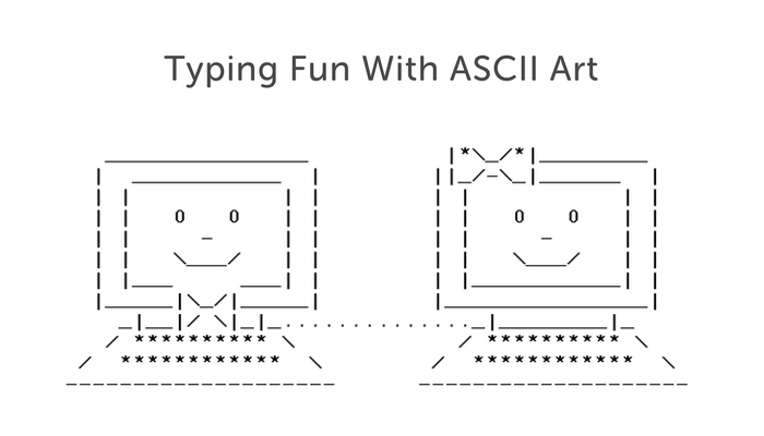
Typing Fun With ASCII Art
Painting, sculpting, acting, and singing are all considered arts.
One thing that’s not usually thought of as an art? Typing.
While the primary purpose of typing is definitely communication, there are ways that people manage to apply their creativity to the keyboard.
One such way is through ASCII Art. This art form involves using the characters on the keyboard to create graphic designs.
ASCII Art ranges from the simple to the incredibly complex.
While basic designs such as this fish ><((((‘> are created on only one line of text, others will span dozens of lines and can be very intricate.
The Evolution of ASCII Art
ASCII Art originated in the 1960s as an alternative to graphic images.
Using only the symbols that exist on a traditional keyboard or even a typewriter, creative typists would design visually-appealing logos and banners for documents.
Awhile back, when emojis were still in their infancy, my Co-Founder Austin created a smartphone app called TextPics that allowed users to incorporate ASCII Art in their text messages.
The app took off and actually helped fund the creation of Typing.com.
ASCII Art also has great potential for use in the typing classroom. It challenges students to use symbols and punctuation marks that don’t always get regular use.
Check out the tips and resources below for how you can use ASCII Art in your typing classroom.
Creating ASCII Art with Students
ASCII Art can be a great way to get students practicing with using advanced symbols and punctuation marks on the keyboard.
There are plenty of ingenious resources available that teachers can use for free.
Step 1: Pick your ASCII art
A quick search on Google will bring up many different sites with ASCII art. To get you started, here are some ASCII art images that kids are bound to love:
Step 2: Put the art in an ASCII art generator
One of our favorites is this ASCII art generator. You can paste in any ASCII Art image that you find online, and the generator will instantly create directions to recreate the image.
You can then give these directions to students who will need to use their typing skills (and attention to detail) to recreate the image.
The fun of this is that students won’t know what image they’re creating until they finish. It’s almost like a mystery puzzle!
Just make sure that students use a monospaced font such as COURIER.
Here is a list of other monospaced fonts that will work (thanks to George Somers who commented on a previous post with this tip!).
Whoever said typing isn’t an art!?!

